the rowan
Located outside the Twin Cities, the brand for this new multifamily development was inspired by the urban conveniences and natural surroundings that the location offered to its residents. The logo and secondary icon reflect this dual lifestyle coming together through the straight and wavy lines, which then create a distinct visual language for various collateral and web, all complimented with sophisticated messaging.


A custom video was created for the home page of the website. It allows the user to engage with imagery, video and messaging that further highlight the best of both world’s lifestyle. The top half of the icon represents the interior amenities and spaces, while the bottom wave is used to reflect the expansive outdoor offerings that surround The Rowan.


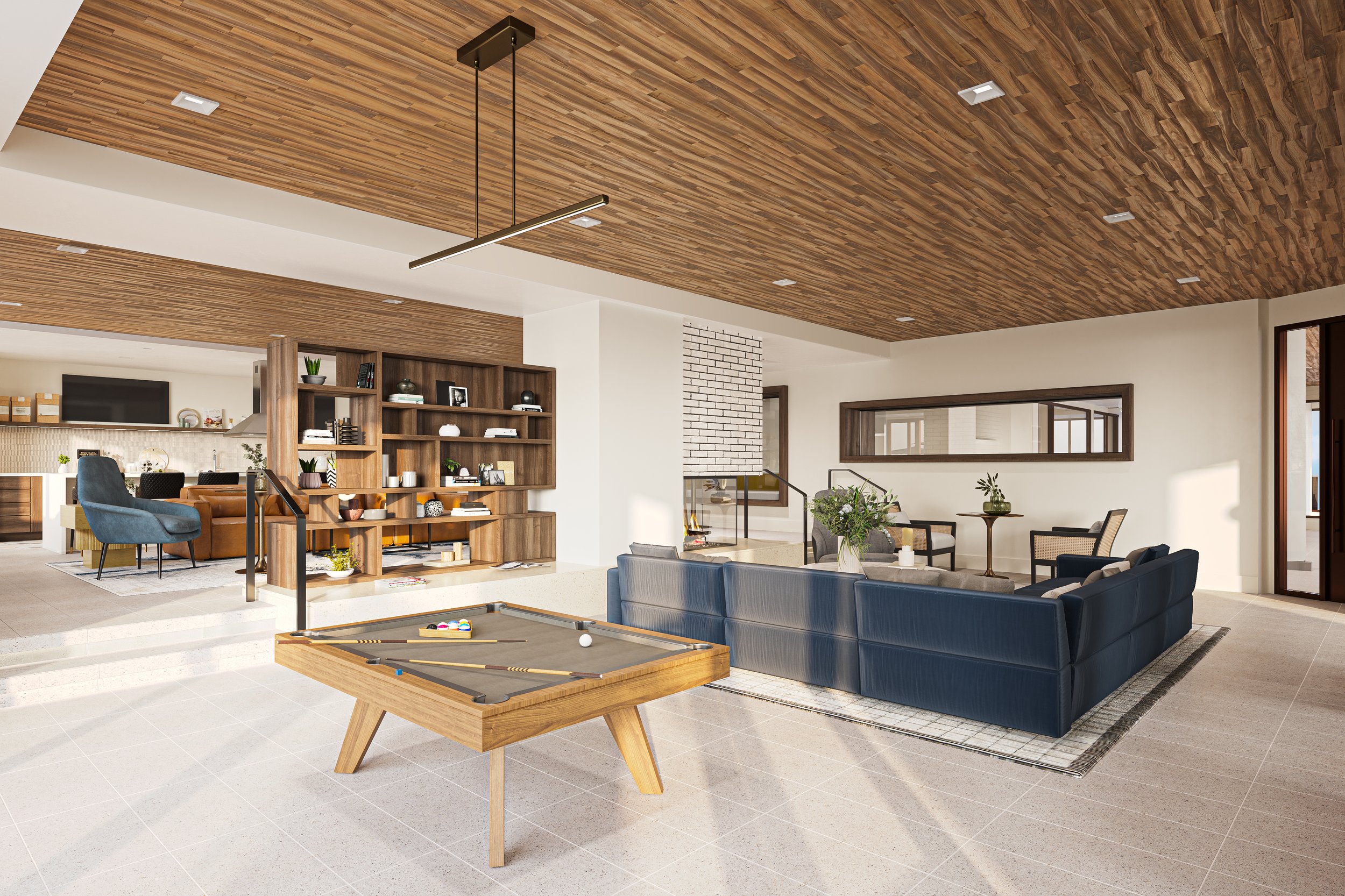
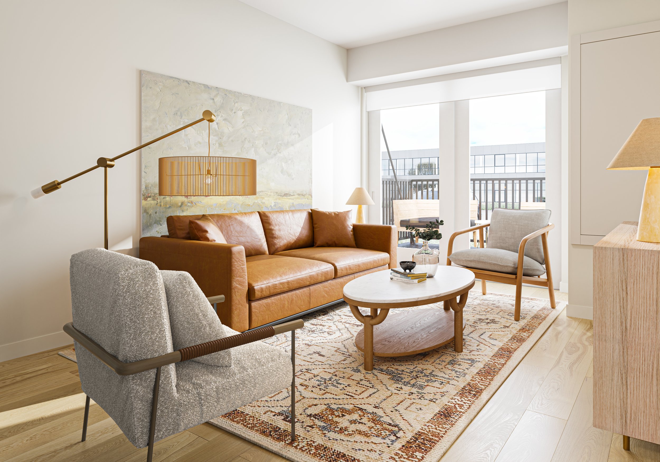
A custom website was designed to highlight amenities, floor plans, neighborhood features and sustainable living. Various functionalities used throughout help keep a lot of content streamlined, therefore keeping the site easy to navigate and digest.


